Bid Density
Overview
Bid density is the volume of bids that are recorded on a publisher’s inventory. Higher bid density means more competition among bidders for the inventory, which drives seller RPM higher. In the SpringServe UI, Bid Density Graphs are available for Client Side & Server side Header bidding and Open market Demand Classes. The Bid density graphs in SpringServe should give publishers an idea about how their inventory is being appraised by themselves and by bidders bidding on their inventory. These graphs aim to provide more insight and visibility to publishers on price points of their bid floors for Open Market & header Bidding demand tags. Additionally, because Open Market graphs have bidder specific views, this insight extends to bidder specific floors as well which is exclusive to Open Market Demand Tags.
Here are some of the potential ways in which a publisher can use the Bid Density Graphs:
- Understand how their inventory is valued by bidders.
- Get a sense of how many bids their inventory receives at specific price points for a given day.
- Understand the effects of pricing their inventory by looking at the overall and bidder specific bid distributions.
- Get a sense of floor price changes and their impact on bidder behavior.
Viewing the Bid Density Graphs
Open Market
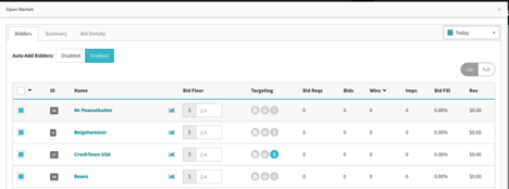
Once you click on the Open Market demand tag in your waterfall, we will open the Open Market Modal with three tabs called Bidders, Summary and Bid Density. The bidders tab shows all the bidders that are associated to this Open Market Demand Tag and the floors applied to each of them as shown in the screenshot below.
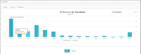
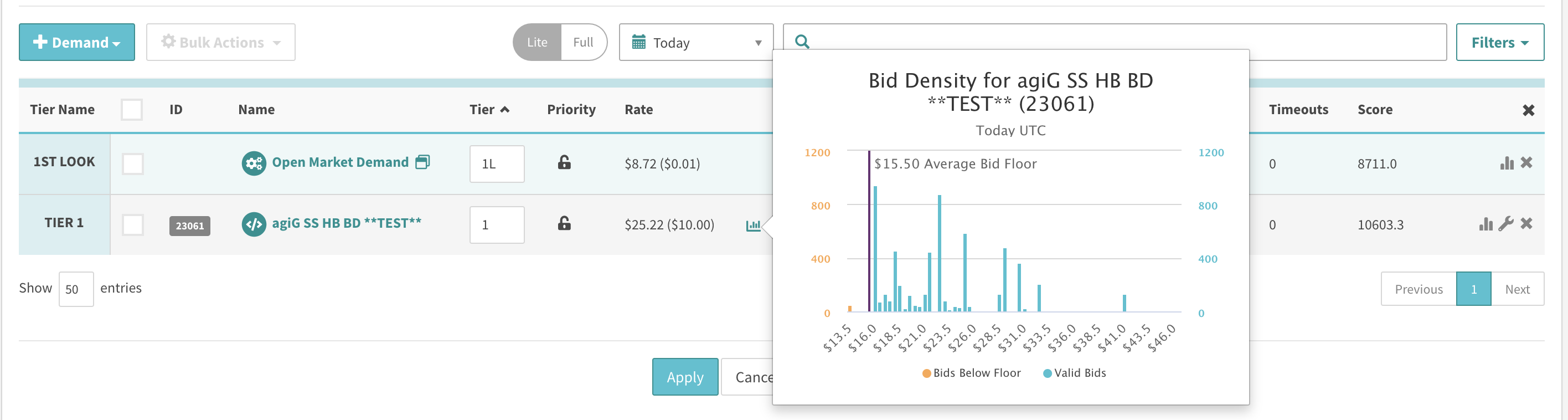
Clicking on the Histogram icon to the left of the bid floor next to the bidders will display the bid density graph specific to this bidder as highlighted in the screenshot below.
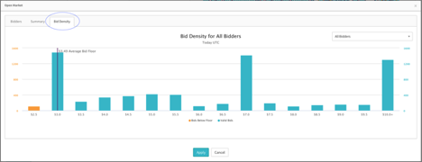
The second place the bid density graphs are visible is in the bid density tab of the Open Market Modal highlighted in blue in the screenshot below. This is the default view of the summary bid density graphs.
Header Bidding
Hovering over the Histogram icon to the left of the demand tag rate in the waterfall will display the bid density graph specific to this demand tag as highlighted in the screenshot below.
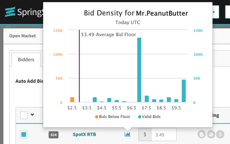
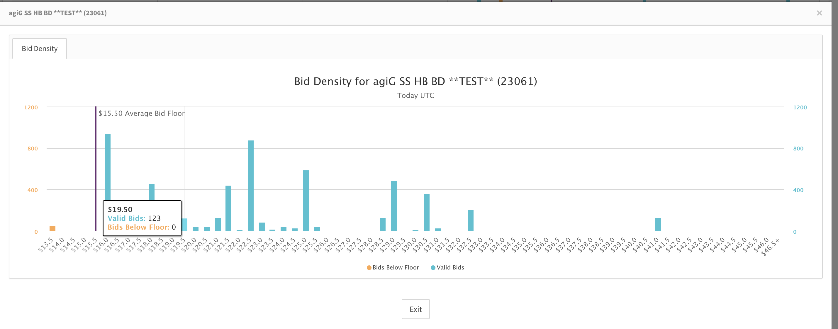
Click the histogram icon and this will open a modal as highlighted in the screenshot below. In the modal, you can hover over data points and the label displays the bid bucket, number of valid bids, and the number of bids below floor. This is the default view of the bid density graphs for header bidding demand tags.
Viewing Bid Density Graphs in the waterfall tab of a Supply Tag
Summary graphs for Bid Density statistics for all applicable demand classes can be viewed by navigating to the waterfall page of a supply tag and you can see the graphs as displayed in the screenshot below.
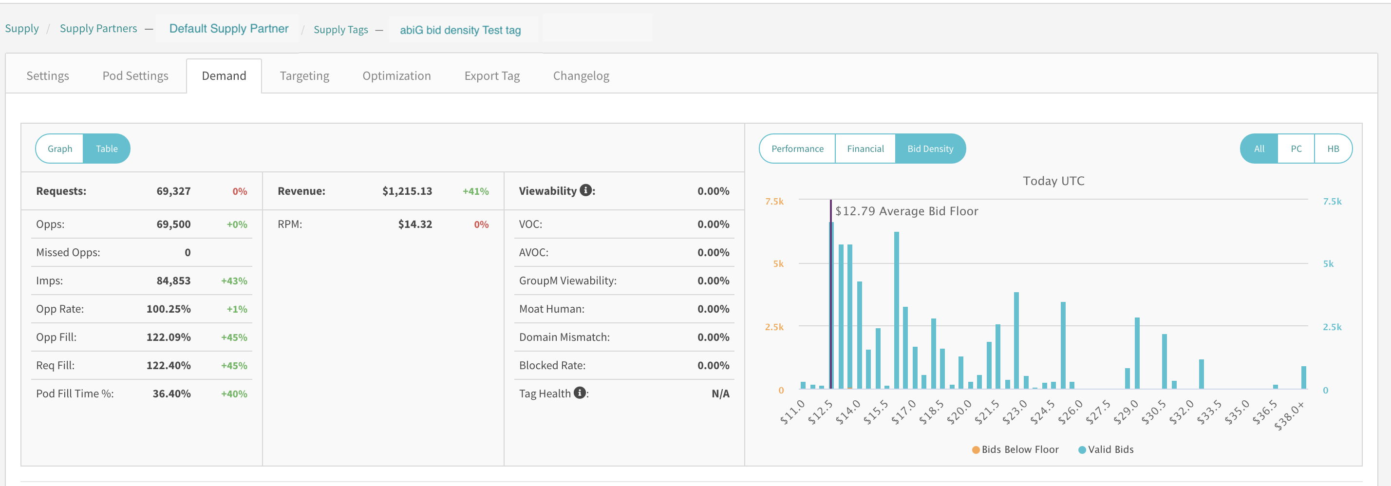
Depending on whether you have active Open Market, Server Side Header Bidding & Client Side Header Bidding Demand tags in your waterfall, you shall see a graph with a pillbox called Bid Density and clicking on this shall reveal a pillbox with a maximum of three options labeled All, PC, HB. It is important to note that if you don't have any of these demand classes in your waterfall, this pillbox shall not be visible in this view. If you have any of these demand classes in your waterfall, you will see the Bid Density pillbox and the second pillbox with options relevant to the demand classes you have in your waterfall. The default view in this graph has All selected as shown in the screenshot above. The stats displayed under the All option display the data aggregated under all applicable demand classes, and the option HB aggregates bid density data under both Server Side and Client Side Header Bidding Demand classes.
Viewing Bid Density Graphs in the Supply Tags Tab of a Demand Tag
Similar to the summary graphs in the waterfall tab of a supply tag, these graphs can also be viewed in the Supply Tags tab of an Open Market or Header Bidding Demand tag as shown in the screenshot below.
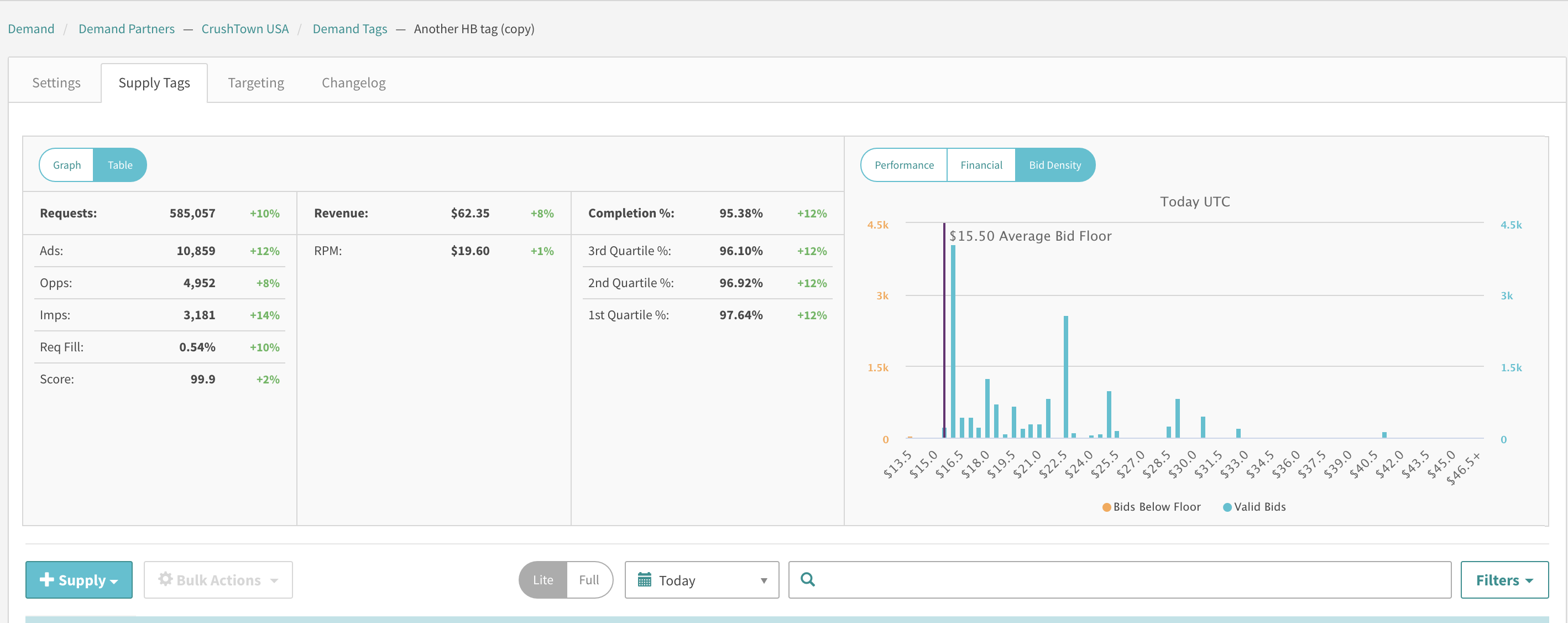
These graphs have the same features as the ones in the waterfall tab with one noticeable difference. Given that these graphs are specific to a demand tag, when looking at the Bid Density tab, you will not have a secondary pillbox with the options to look at All, PC or HB demand classes. Additionally, the stats displayed in this view show the data aggregated by the specific demand tag.
Interpreting the Bid density Graphs
Both the hover-over and the summary graphs have the same features.
Metrics
These are the bars visible in the histogram. You can see the actual values of the bars in the histogram if you hover over a specific graph.
- Valid Bids – These are bids that were received from a bidder’s bid response when the bid values were equal to or higher than the bid floor set on a bidder. This metric will be highlighted in teal in the graphs.
- Bids below the floor – These are bids received from a bidder’s bid response when the bid values were less than the bid floor set on a bidder. This metric will be highlighted in orange in the graphs.
X-Axis
The Bid prices as received from bidders and rounded off to 50 cent intervals. Please note that the intervals are for display purposes only. So, as an example, if we receive a bid value of $4.46 against a bid floor of $2.50 from a bidder, this bid will be marked as a valid bid and will be displayed in teal in the bar at an X-axis value of $4.5
Time Period
The time period for all bid density graphs is the current day in UTC.
Average Bid Floor Line
The Average bid floor is calculated as a simple average of all the bid floor values for the current day in UTC. As far as it’s placement on the graph is concerned, we place this in the lower $0.50 bucket while showing its actual average value. Thus, in this screenshot below, you see an average floor line of $3.49 placed on the $3.00 X-axis bucket. The range of the X-axis is computed by the graphs. If the average bid floor price is not in the current range of the x-axis, it won’t show up.
Bidder Filter
This is a filter that lets you choose the graphs you want to see for a specific bidder or for all bidders. Note that the default value of this filter is all bidders. Depending on the filer chosen here, we calculate the data for all bidders or for a specific bidder for the metrics and for the average bid floor price line.
Enhanced Functionality
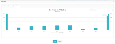
- Zoom: In the summary graphs visible on the bid density tab, you can zoom in on a specific area of the graph. With a mouse pointer, the zooming is performed by dragging out a rectangle in the chart. When zooming, a button appears called Reset Zoom that lets the user zoom out.
- Select/Deselect metrics: You can choose to see either one of the metrics if you click on the labels highlighted in blue in the screenshot below.
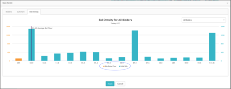
The screenshot below shows the default view for all bidders with all metrics selected and no zoom enabled on the graph.
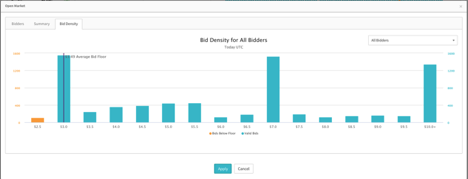
The screenshot below is the same graph as the one above with Bids below the floor deselected and a zoom enabled on the X-Axis values from $3.5 through $7.0 As you can see, in the zoom view, a Reset Zoom button appears on the top right corner of the grid area and clicking that will reset the graph to the default X-axis range for the filter selected.
The screenshot below is with a specific bidder chosen in the bidder filter.